Utility Classes
markup uses a number of utility classes to allow users to easily set CSS values to markup without having to use inline styles. Specific class names will apply pre-configured styles to your element.
Note: Some utility classes will apply addtional styles not shown here for magical layout powers; these can be edited on a customer by customer basis by the design or dev teams.
CSS Grid Properties
| Classname | What it does |
|---|---|
.grid | Makes the element a 24 column grid with auto-height rows. |
.grid-item | Places an element inside of the CSS Grid. 3 columns wide by default. |
.grid-item--25 | Creates a 6 column element on screens above 768px. |
.grid-item--50 | Creates a 12 column element on screens above 768px. |
.grid-item--75 | Creates a 16 column element on screens above 768px. |
.grid-item--100 | Creates a 24 column element on screens above 768px. |
.grid-item--link | Creates a grid element with a primary color backgroud and centered white text. |
.gap | gap: 10px; (Can be applied to Flexbox or CSS Grid elements) |
Note: Modifier classes (ex. .grid-item--25) must be used in conjuntion with the base style (ex. .grid-item)!
Examples
<div class="grid">
    <div class="grid-item">
        <div class="bg-box"></div>
    </div>
    <div class="grid-item">
        <div class="bg-box"></div>
    </div>
    <div class="grid-item">
        <div class="bg-box"></div>
    </div>
</div>
will result in…
or…
<div class="grid">
    <div class="grid-item grid-item--25">
        <div class="bg-box"></div>
    </div>
    <div class="grid-item grid-item--25">
        <div class="bg-box"></div>
    </div>
    <div class="grid-item grid-item--50">
        <div class="bg-box"></div>
    </div>
</div>
will result in…
Flexbox Properties
| Classname | What it does |
|---|---|
.flex | display: flex; flex-wrap: wrap; |
.flex-column | flex-direction: column; (Stacked Layout) |
.flex-row | flex-direction: row; (Row Layout) |
.align-center | align-items: center; |
.align-start | align-items: flex-start |
.align-end | align-items: flex-end |
.justify-center | justify-content: center; |
.justify-start | justify-content: flex-start |
.justify-end | justify-content: flex-end |
.gap | gap: 10px; (Can be applied to Flexbox or CSS Grid elements) |
Examples
<div class="flex flex-column align-start justify-start gap">
    <div class="box"></div>
    <div class="box"></div>
    <div class="box"></div>
</div>
will result in…
or…
<div class="flex align-center justify-center gap">
    <div class="box"></div>
    <div class="box"></div>
    <div class="box"></div>
</div>
will result in…
Mobile Stack Order
These classes can be used to set the priority of items in a mobile view.
| Classname | What it does |
|---|---|
.stack--1 | order: 1; |
.stack--2 | order: 2; |
.stack--3 | order: 3; |
Example
<div class="grid">
<div class="text stack--2">
<h2>I am some text!</h2>
<p>Shrink the screen to see the elements reorder!</p>
</div>
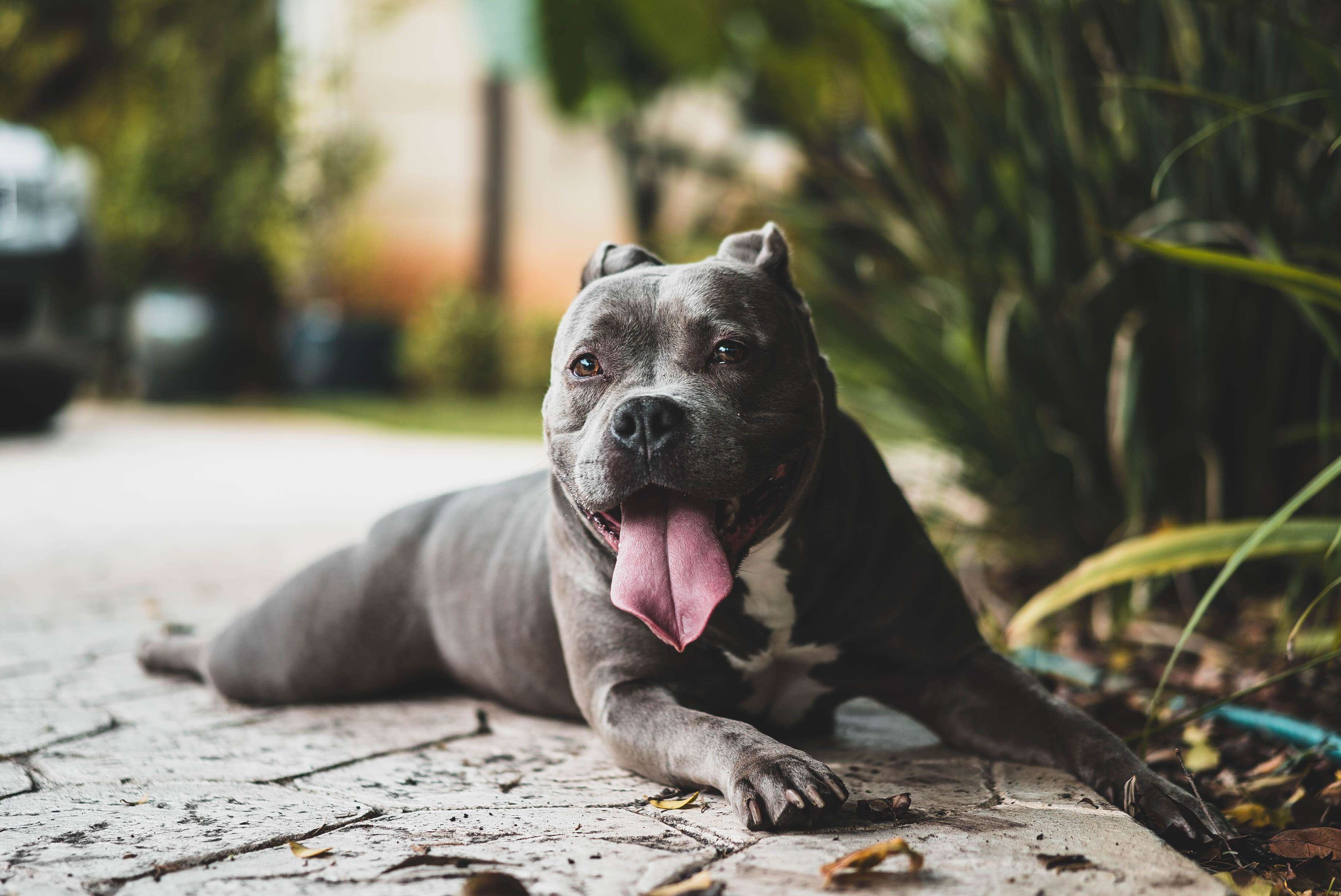
<div class="image stack--1">
<img src="/assets/images/dogs/christopher-ayme-157131.jpg">
</div>
</div>
will result in…
I am some text!
Shrink the screen to see the elements reorder!
Colors & Background Colors
Markup uses your existing site palette to set colors. Use the following class names to apply the corrosponding palette color to your element or it’s background.
| Classname | What it does |
|---|---|
.palette-color--color-1 | color: $color-1; (always black) |
.palette-color--color-2 | color: $color-2; (always white) |
.palette-color--color-3 | color: $color-3; |
.palette-color--color-4 | color: $color-4; |
.palette-color--color-5 | color: $color-5; |
.palette-color--color-6 | color: $color-6; |
.palette-bg--color-1 | background: $color-1; (always black) |
.palette-bg--color-2 | background: $color-2; (always white) |
.palette-bg--color-3 | background: $color-3; |
.palette-bg--color-4 | background: $color-4; |
.palette-bg--color-5 | background: $color-5; |
You can set a 20% darker shade of the color by adding -dark to the end of your class name. i.e. .palette-color--color-4-dark
Example
<div class="container flex flex-column align-start justify-center">
    <span class="palette-color--color-3">Why are there so many<span>
    <span class="palette-color--color-4">songs about rainbows,<span>
    <span class="palette-color--color-5">and what's on<span>
    <span class="palette-color--color-3">the other side?<span>
</div>
will result in…
and
<div class="container flex align-center justify-center">
    <div class="box-clear outer--10 palette-bg--color-3"></div>
    <div class="box-clear outer--10 palette-bg--color-4"></div>
    <div class="box-clear outer--10 palette-bg--color-5"></div>
    <div class="box-clear outer--10 palette-bg--color-6"></div>
</div>
will result in…
Min Height
I’m not short, I’m fun sized. 🤪
| Classname | What it does |
|---|---|
.min-height--300 | min-height: 300px; |
.min-height--500 | min-height: 500px; |
Example
<div class="container">
    <div class="palette-bg--color-3 min-height--300"></div>
</div>
will result in…
Max Width
“A lot of people are afraid of heights, not me, I’m afraid of widths.”
| Classname | What it does |
|---|---|
.max-width--1000 | max-width: 1000px; |
.max-width--1400 | max-width: 1400px; |
.max-width--1600 | max-width: 1600px; |
Example
<div class="container">
    <div class="palette-bg--color-3 min-height--300 max-width--1000"></div>
</div>
will result in…
Text Align
A paragraph is better lived and experienced only when it is aligned. 🤓
| Classname | What it does |
|---|---|
.text-left | text-align: left; |
.text-center | text-align: center; |
.text-right | text-align: right; |
Example
<div class="container">
    <p class="text-left">Hey you, out there on the road</p>
    <p class="text-center">always doing what you're told</p>
    <p class="text-right">can you help me?</p>
</div>
will result in…
Hey you, out there on the road
always doing what you're told
can you help me?
Margin & Padding
Margin and padding can be easily set by adding the outer--** or inner--** class to your element.
| Classname | What it does |
|---|---|
.outer--10 | margin: 10px; |
.outer--20 | margin: 20px; |
.outer--40 | margin: 40px; |
.outer--60 | margin: 60px; |
.outer-top--20 | margin-top: 20px; |
.outer-bottom--20 | margin-bottom: 20px; |
.outer-top--40 | margin-top: 40px; |
.outer-bottom--40 | margin-bottom: 40px; |
.outer-top--60 | margin-top: 60px; |
.outer-bottom--60 | margin-bottom: 60px; |
.inner--10 | padding: 10px; |
.inner--20 | padding: 20px; |
.inner--40 | padding: 40px; |
.inner--60 | padding: 60px; |
.inner-top--20 | padding-top: 20px; |
.inner-bottom--20 | padding-bottom: 20px; |
.inner-top--40 | padding-top: 40px; |
.inner-bottom--40 | padding-bottom: 40px; |
.inner-top--60 | padding-top: 60px; |
.inner-bottom--60 | padding-bottom: 60px; |
Example
<div class="container flex align-center justify-center">
    <div class="box outer--10"></div>
    <div class="box"></div>
</div>
will result in…
and
<div class="container flex align-center justify-center">
    <div class="box outer--20"></div>
    <div class="box"></div>
</div>
will result in…
<div class="container flex align-center justify-center inner--10">
    <p>Pull up to the scene, but my roof gone.</p>
</div>
will result in…
Pull up to the scene, but my roof gone.
and
<div class="container flex align-center justify-center inner--20">
    <p>When I leave the scene, bet your boo gone.</p>
</div>
will result in…
When I leave the scene, bet your boo gone.